ATB Shifts Its Look: What Sets Blue-Front and Black-Front Stores Apart.

The Evolution of ATB Supermarkets
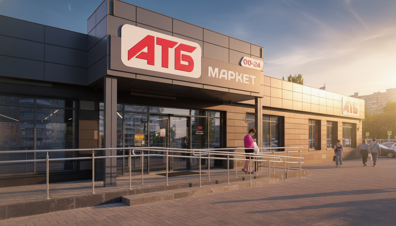
According to Novyny.live: ATB supermarkets, recognized for their affordability and wide product selection, are pushing forward with new store formats. A particularly notable development is the contrast between their blue-front and black-front locations—differences that go beyond exterior color to include service features and pricing strategies.
ATB first launched blue-front supermarkets in Ukraine, marking a major milestone for the chain. However, starting in 2017, black-front stores began appearing on the market. This format was introduced around a decade ago as part of the 'black ATB' project. Key distinctions of the black-front ATB stores include:
- a broader product range;
- faster checkout and service;
- a refreshed design.
Over the years, the share of black-front ATB locations has continued to grow, signaling strong consumer demand for this format. Prices for identical items remain the same across both formats, making the choice between blue and black largely a matter of personal preference. In this way, ATB offers diverse supermarket options tailored to customer needs and tastes, which in turn strengthens the company's market position.
Current Trends in the Consumer Market
The rollout of different ATB supermarket formats aligns with modern consumer market trends, where pricing alone is no longer enough—shopping experience matters too. Innovative approaches to design and service can attract new customers and boost loyalty among existing ones.
“The company is well-positioned to strengthen its standing in a competitive environment, a crucial factor for continued growth.” - Source unknown
Read also
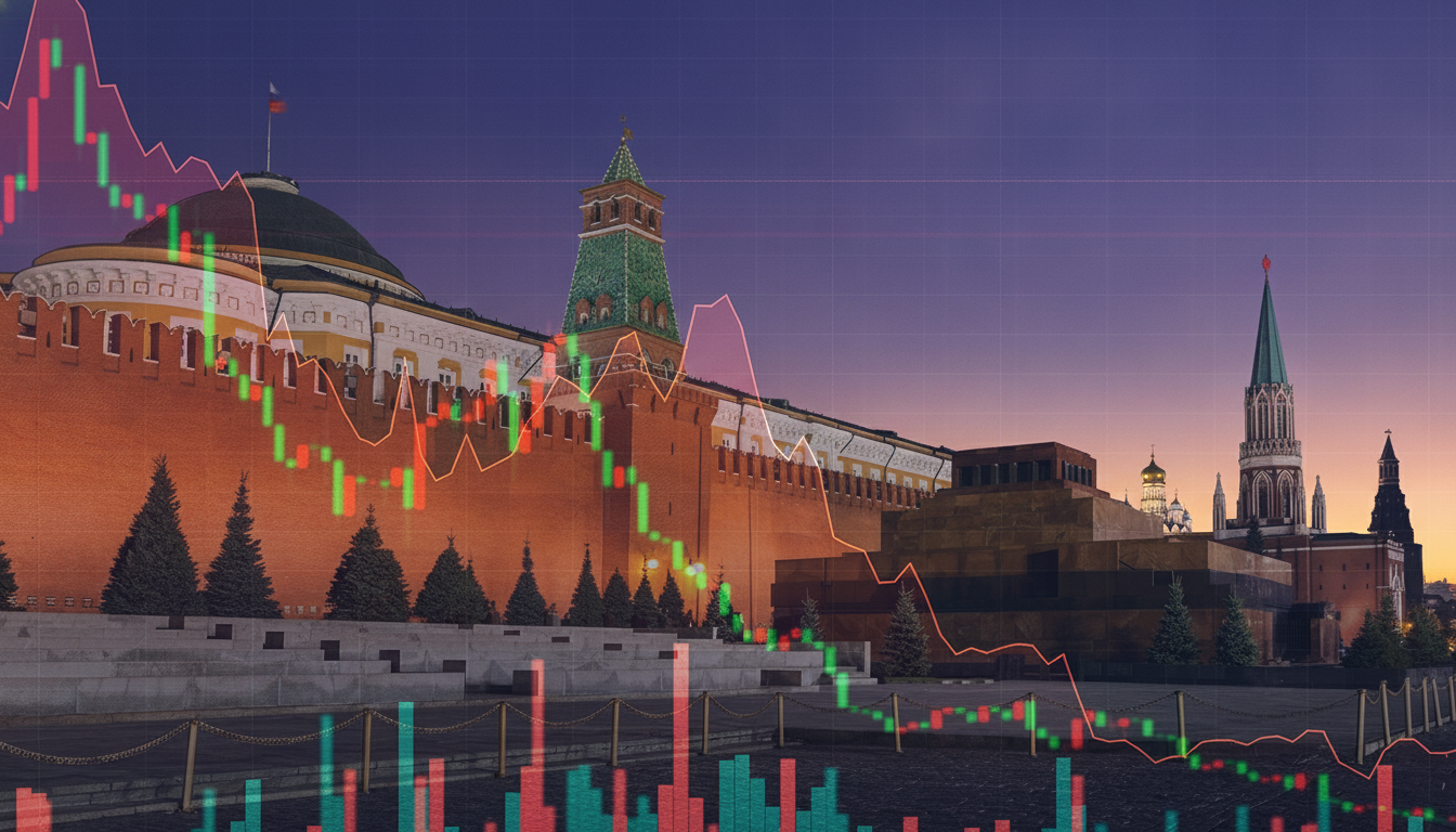
- Russian Billionaires Accelerate Capital Flight Abroad Amid Growing Economic Fears
- Fuel Shortages and Rising Prices Drive Russians to Buy Foreign Currency in Droves
- Capital Flight from Russia: Why Billionaires Are Moving Assets Abroad
- New Government Center to Manage Employee Reservations: Salary Thresholds Set at Critical Levels
- Russia’s 2026 Budget Deficit Could Hit a Record 4.83 Trillion Rubles
- Nearly 50 Million UAH Allocated for a New Kyiv Heating Plan: What’s Changing